Two Y-axes in Excel chart insert
- Open Excel and mark your chart.
- Click on "Insert" to "column" and select, for example, a 2D-type of column.
- A chart will be created for you. Click the column chart to a bar value. After you have marked out, for example, the red columns, click with the right mouse button on the marker. Select the rows of the "data change chart type...".
- In the opened window, select e.g. "line", the red columns as a line.
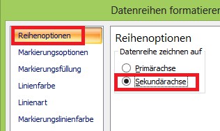
- Select the red line and click again by right-clicking on it. Now select "format data series..."
- Under "series options" put a tick "secondary axis". Your chart has two Y-axes.
In a further practical tip you will learn how to Pivot tables in Excel.
Latest Videos
Select your chart and choose a column type.
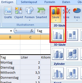
Select your chart and choose a column type.
Please mark in the diagram, for example, the red bar and change its chart type.
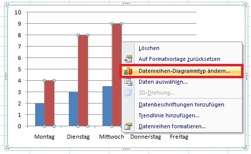
Please mark in the diagram, for example, the red bar and change its chart type.
Select the type of chart, a "line".
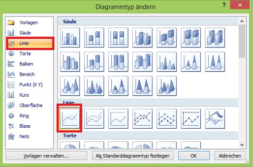
Select the type of chart, a "line".
You format the data series.
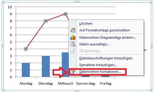
You format the data series.
Select "series options"->"secondary axis".
"Secondary axis"." />
 "Secondary axis"." />
"Secondary axis"." />
Select "series options"->"secondary axis".
You get a chart with 2 Y-axes.
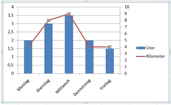
You get a chart with 2 Y-axes.