Origin: add records
The data for the chart, add in the window "Book1".
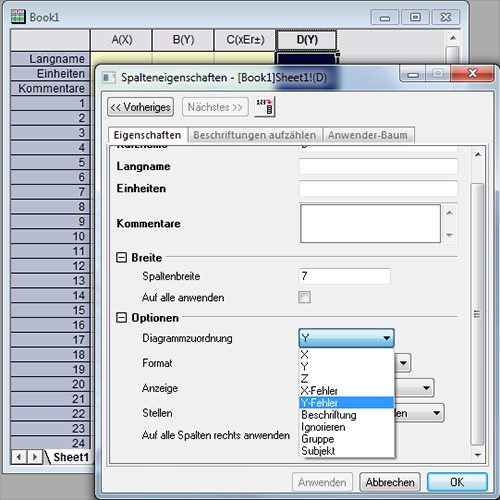
- In the head of the columns, you can see for what axis, the value should be specified.
- About "long name" and "units" set the label of the respective axis. For example, you can enter the weight here "mass" and "kg".
- You want to create a new column, in the blank area right click and choose "New column". Click on the column then to the right and go to "settings", you can specify under the "chart mapping" the type of the value in the column. In this way, you can add the values for the error bars.
- The values you can enter in the white cells.
Add new column
Origin: point chart
There are generally two different point charts: the scatter chart and the point-line graph. The point-line graph only two consecutive values are connected.
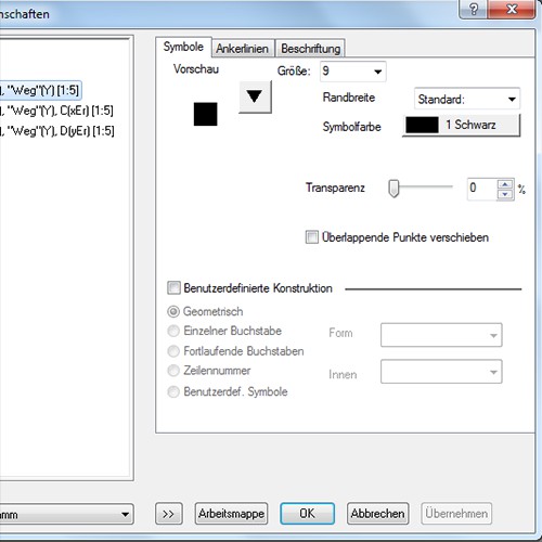
- You can highlight the data you want to display in the chart.
- Go to the "Draw" > "Symbol to" > "scatter chart". For a point-line graph, select "Draw" > "point-line-chart" > "point-line diagram".
- The display you can customize now free. Click on a data point, first with the left and then to the right, you can specify on the "plot Details", among other things, the size, color and shape of the point. The error bars, you can edit it to analog.
Design in the point chart change
Origin: column and bar charts output
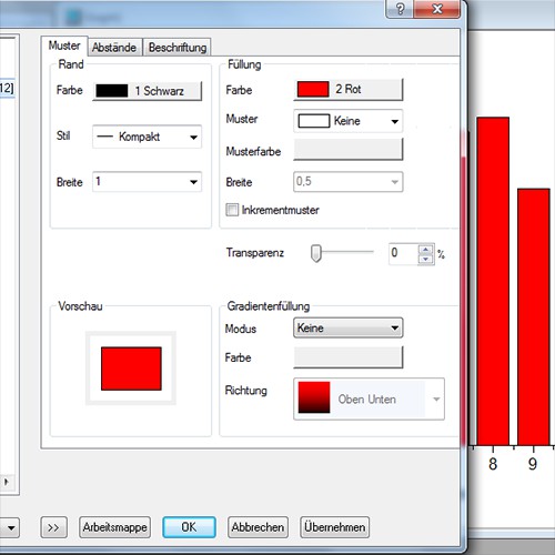
- You can highlight the data you want to display in the chart.
- For a column chart, select "Draw" > "columns/beams/circle", > "column chart". You want to see the individual columns of the respective values, choose "columns + caption". Here you can also select the "bar chart".
- As in the point graph, customize the Design, by the bar clicking with the left and then right and go to "settings". So you can gradients, among other things, color and the spacing between the beams to define.
Column chart customize
Origin: the axes of the graphs to customize
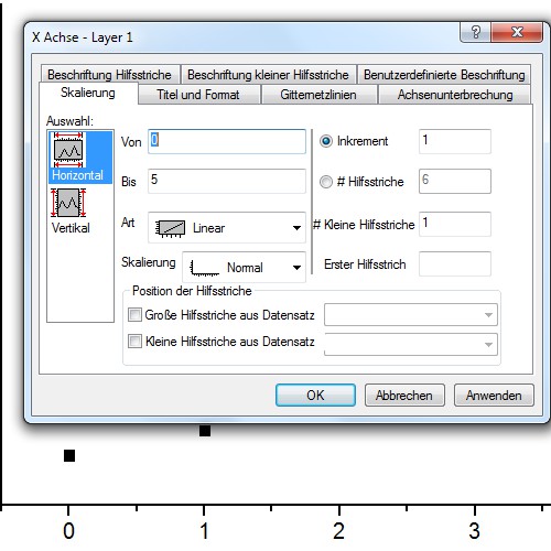
You have values that start at 0, it may be, however, that the axes start at a value of -1. To correct this, edit the axes:
- Click to edit axis, first with left and then right and go to "scale".
- Now you can set in the fields "From" and "To" which area should be visible. With "increment" to specify the interval, in which a new value on the axis shows should be. You want to scale one axis is logarithmic, change "type" to "ln".
- In the other points, you will find many other settings, such as you can display the axis label and values. For example, go to "custom label", you can specify under "Rotate" the angle at which the values on the axis are rotated to.
Axis representation edit
Origin: Fit-functions define
In order to compare measured values with expected results, you can have the chart Fit curves to draw.
- You have to select the connect data points with a left click.
- Go to "analysis" > "Customize". Depending on what kind of function you need, you can select the respective representation. Select the desired area of "open Dialog".
- In the case of a non-linear Fit, you need to select the "category", for example, a damped sine wave. Confirm the window with "Fit" or "OK". In your diagram, you can now find the calculated function.
- Own functions you can define by selecting "non-linear Fit" and then under "category" with the value"".
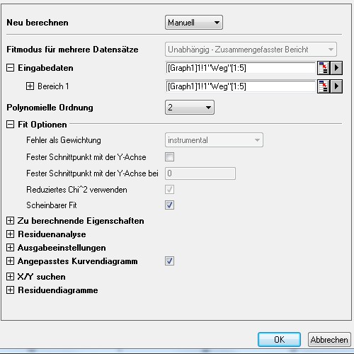
Fit functions by points
The graphics created, you save it via "file" > "export images".
In addition to the presented diagram, types Origin provides many more. So you can, for example, create scatter plots in 3D or surface charts. For everyday tasks, the diagrams in OpenOffice from.