Chart values in OpenOffice-enter a table
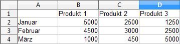
Before you is a chart in OpenOffice can create, you need it fill it with data. First, consider what you want to represent:
- Enter the top in the first line of your categories, such as products. Each product then receives beams a chart.
- In the left column of the time come then, for example, rooms. In this example, months are selected. The periods of time you will find later on the x-axis.
- Enter then according to their values for the product per month.
OpenOffice-create a chart
Graphs from table of values in OpenOffice to create
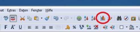
You can then create your chart from the previously defined table:
- Highlight your entire table. This also includes the specified categories, such as products and time periods.
- Click on the chart icon in your icon bar (see photo).
- A new window will open. Here you can select the type of chart (columns, bars, pie, areas, lines).
- Optionally, you can enter your "chart elements" is also a title, or the legend completely hide.
- Confirm your selection with "finish". The chart now appears in your document. With the mouse, you can move it freely.
Data-create charts
In another practical tip we show you how to use OpenOffice, images to crop can.